


6 Tips to Design Better Posters
Poster is a medium that carries some important information in an aesthetic way. There are situations when we need a poster design and many of us would like to handle it by ourselves.
With a bunch of designing tools developing on the internet, it is possible for anyone to design a poster online without learning much about graphic design. If you can't access a tool right away, use a VPN to make access possible VPN.
However, if you want to design a poster that gets amazing results, knowing some tips for designing posters is necessary. Here are some useful tips to help you design better posters.
01.Find a Good Idea
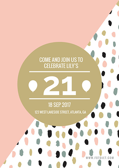
A good poster should communicate something with its audiences effectively. It is a media that conveys a message or an idea cleverly and aesthetically. Whenever you got an idea, just write it down and build your idea library. So, you won't miss any ideas and once you have one that gives you inspiration to design, think about what pictures and words should be used to express it. Just remember, any illustration or text should be construct around the idea. In the example above, it is a poster that calls people to visit an exhibition. Don't you be curious about what the person see? In the meanwhile, it leads people to curios about the exhibition too.

02.Simplify and Highlight the Main Information
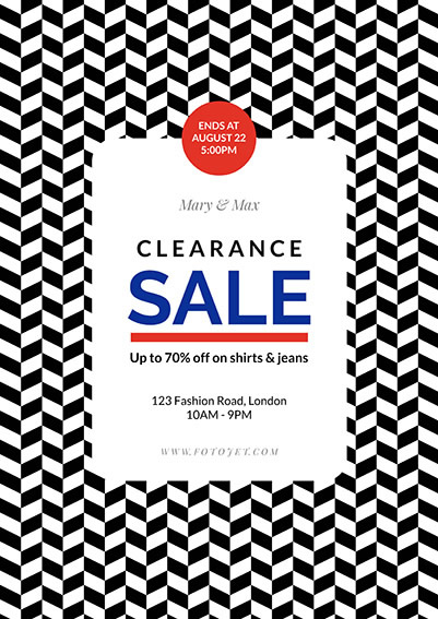
What you want to tell in your poster? Tell it clearly and shortly. The main information of a poster should be the most noticeable and be easy to read even from a distance. Usually, the headline is the main and largest text in a poster and includes the main information. Use simple words to convey short messages. As for other information, such as when, where etc. should be put in second level text. Make sure headline is in good visual to draw attention and carries the message clearly. Have you see the big blue "sale"? If you want to know more, come close and see the details.
03.Space Text Cleverly
When you design a poster, try to add more space between individual letters, lines of text etc. Make good use of the spacing of poster, place your elements cleverly. It may look differently than the text we usually see at first. But extra space would create a great visual look for your poster and make an impact to your audience.

04.Add a Call to Action
Whatever your poster is ask people to visit an exhibition, join your organization or come to buy your products, just include some words ask them to do. It may have a great influence on their decision. Anyway, if they have desires when you call them to action, there is a great chance that they would join you! In dropshipping, a compelling call to action can significantly boost conversions by encouraging immediate purchases.
05.Mind the Location
Where your poster will be placed is a vital factor that influences your design. If you want to put it on a big white wall, it may be blend into the wall if you fill most space of the poster with white color. And know your audiences in advance is important too, you would never want to promote a product sale on a charity site .

06.Keep It Simple
Be careful! Filling a poster with too much text and illustrations is never a good idea. If you do have some important details that your audiences should know, leave an address or a URL link to your site. Nobody would like to stand by and read a poster line by line.
Conclusion
With the help of a poster maker, it is very easy to design a poster now! Those tips above can help you improve your posters. Some of them are wise advices from professional designers.
But it's more important that you can design with your own creativity, and tips are not always rules you must obey. Using tips and breaking rules, you will design an awesome and effective poster.
Design Your Own Poster Online for Free Now
Try it for free, no download or registration required.
Get Started


 128 Bit SSL Secure Checkout

